Which is part of why I find cover design so fascinating. Especially these days, with a constant influx of amazing new books coming our way and Bookstagram accounts showing off gorgeous covers, image is important. And I love seeing how different cover designs can completely change our perception of a book, making it more eye-catching or setting a completely different tone. From international covers to new editions, these 10 gorgeous cover redesigns will show you just how much we all judge a book by its cover.
Hold Still by Nina LaCour
To celebrate the 10-year anniversary of the publication of Nina LaCour’s first book, Hold Still, designer Samira Iravani teamed up with illustrator Adams Carvalho to create an entirely new (and stunning) cover for the book. This is the same incredible team behind the cover of Darius the Great is Not Okay and Nina LaCour’s Printz Award–winning book, We Are Okay. The new design is set to hit shelves Feb 26th, and if you aren’t fully in love with it I just don’t know what else to say. It’s warm and lovely but kind of distant, and if you couldn’t tell, I’m a little bit obsessed. (It’s also the design that inspired this entire post, so…)
Ayesha at Last by Uzma Jaluladdin
The recently released U.S. cover for Uzma Jalaluddin’s upcoming modern reimagining of Pride and Prejudice (on the right, available June 4th) and the original Canadian and UK version (on the left) are both lovely. But I’ve gotta say, the bright purple pop of the hijab with that gold background just really catches my attention!
Record of a Spaceborn Few by Becky Chambers
Like the first two books in the Wayfarers series before it, Record of a Spaceborn Few features two gorgeous (and very different) covers. And I’m so in love with both of these designs it’s kind of hard to pick a favorite. The UK version (on the left) is so dreamy, but there’s something just so fun about the pulpier U.S. cover (on the right) that feels somehow lighter and more connected to sci-fi of years past. They’re both so pretty and unique that a part of me wants to see both of them on my shelves! The UK version of the cover was designed by Natalie Chen. The U.S. cover was illustrated by Christopher Doll, who talks about the process of creating the cover and working with Chambers’s designs for the spaceship in an interesting piece on his website.
Ayiti by Roxane Gay
Roxane Gay’s debut collection of short stories exploring the Haitian diaspora, first released in 2011, features a photograph taken in Haiti by Gay’s mother. It doesn’t get much sweeter than that! But I’ve got to say the new design for the recent rerelease by Grove Press is just gorgeous. I love the use of negative space and the bright floral design. It definitely makes me want to pick up the book, that’s for sure.
Akata Witch by Nnedi Okorafor
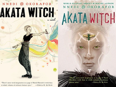
The original hardback edition of Akata Witch, designed by Jim Hoover with illustrations by Jillian Tamaki (incidentally, the author of several books of her own, including This One Summer and Super Mutant Magic Academy), is lovely and magical—but there’s a slight hiccup. The original hardcover is the only version featuring this style. When Viking released a paperback edition in anticipation of the sequel, Akata Warrior, a new artist took over, setting an entirely different design aesthetic. The new paperback cover for Akata Witch, though still designed by Hoover, features art by Greg Ruth, who was hand picked by Okorafor for the job. The new version features a stunning close up of the Nigerian American albino protagonist of the series, Sunny, staring out into the eyes of anyone and everyone who looks at the cover. And it’s a powerful image! Can’t say I have any complaints about the new look.
Carry On by Rainbow Rowell
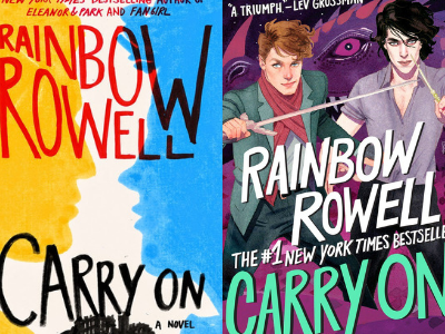
The original hardback cover of Carry On was designed by Olga Grlic, whose designs grace most of Rowell’s iconic book covers (as well as some others like Emma in the Night by Wendy Walker and Baby Teeth by Zoje Stage). I love everything about it from the bright primary colors to the uneven text…but then I saw the new cover, and, well… The paperback edition of Carry On, also designed by Olga Grlic and with art by Kevin Wada, feels like fan art come to life and slapped on the cover of a book, in the best way. You just can’t see that cover and not want to know what those two handsome boys with wands are up to—and why there’s a dragon behind them. The upcoming (and long hoped for) sequel, Wayward Son, features complimentary art by Wada—and, might I just say, a resplendent floral suit for Baz. These covers are killin’ the game.
Men We Reaped by Jesmyn Ward
Jesmyn Ward’s memoir has seen two very different cover designs (at least, in the U.S.). The original Bloomsbury cover (left) is muted and simple, focusing on the text. The paperback reprint (right) has an entirely different feel. Featuring a photograph on the cover (and especially overlaid with that haunting title) draws you in a way the first design doesn’t. It’s a brilliant redesign in my opinion. And the bestselling author of Sing, Unburied, Sing certainly deserves covers just as lovely and unforgettable as her prose.
Undead Girl Gang by Lily Anderson
The new paperback version of Lily Anderson’s Undead Girl Gang is pure kickbutt awesome. I didn’t think I could love anything more than the original cover sporting a zombie pinkie-swear enamel pin—but then this new cover designed by Samira Iravani (yes, the same Samira as before—she designs a lot of gorgeous books, okay) came out. Shadow hands, neon text, and a curvy, Latinx girl looking badass? Yep, I’m sold.
The Beauty That Remains by Ashley Woodfolk
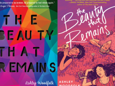
The original cover of The Beauty That Remains is so beautiful (the kind of book I’d definitely buy just to showcase on my shelf, never mind the fact that the story is just as lovely), but somehow I’m just as in love with the new cover, as well. The new paperback design, illustrated by Zeke Peña (who’s also illustrated a number of other gorgeous covers, including Jaya & Rasa), is just perfect. And as Ashley Woodfolk put it in her Instagram post revealing the new cover: “Kids of color front and center. Exactly where they should be.”
Their Eyes Were Watching God by Zora Neale Hurston
Zora Neale Hurston’s seminal work has seen many covers throughout the years. No surprise since it was first published in 1937. The University of Illinois Press 1978 edition (left) has a wonderful vintage feel, but the Harper Perennial Modern Classics (right) is just lovely. The red and white background and floral accents gives it a classic look—which is just as it should be, classic work of American fiction that it is. Let us know your favorite cover redesigns in the comments and whether you judge books by their covers—and if so, which of these are you most likely to pick up? And if you love cover design, you might also want to check out these instagram accounts that celebrate book cover design, these book designer instagrams, and these books you should definitely judge by their (lovely) covers.


