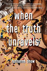
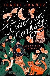
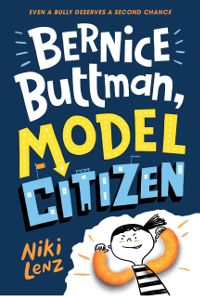
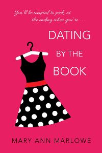
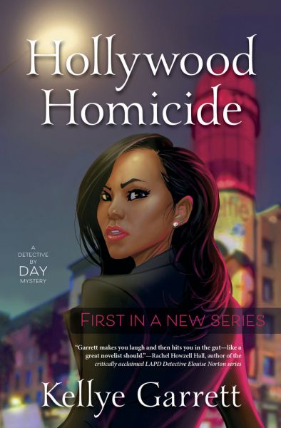
However, whenever a cover is revealed that readers don’t like, the author bears the brunt of the criticism. Which is frustrating because, usually, they have little to no input on the cover. Most of the time in traditional publishing the author gets an email that says, “Here’s your cover! We hope you like it.” Sometimes an author will get to give input that may or may not be used in the design. The case is rare where an author has any sort of authoritative control. RuthAnne Snow, author of When the Truth Unravels, had told her publisher that she hated covers that were all feet. “Lo and behold, I opened the file that held my cover and…it was literally all feet. But after discussing it with my editor, it was clear that they DID understand my request, but that they still felt this cover was best. And weirdly, the more I looked at it, the more I felt like I understood the vibe they were going for and I ended up liking it.” Every Other Weekend author Abigail Johnson said, “I had shared a few cover styles with my publisher that I thought would work for my book but my brilliant art director, Gigi Lau, went a completely different direction and I’m so glad she did! She found an amazing illustrator, Marissa Korda, and together they came up with something that was such a perfect match for my characters and story!” When Anne Rice revealed her UK cover for Prince Lestat, a lot of fans expressed their dissatisfaction with it and were shocked to hear that Anne Rice, one of the most popular authors of the modern era, had no control over her covers. In the still-developing story of the cover designer for Elizabeth Acevedo’s The Poet X using a young photographer’s self-portrait without her permission or knowledge, a lot of anger has been directed at the author. Not only did Acevedo not have a hand in the cover design, even if she had, it wouldn’t have mattered. Assuming the cover designer’s contract was standard, he would’ve affirmed that the cover was his original work and free from another’s copyright claims. An author would have no way of knowing he didn’t create it from scratch unless she had seen the image recently and had an eye for that sort of thing. People unfamiliar with the industry are often confused and outraged when they learn how little say an author has over the cover of their book. But as a former Publicist, Publicity Director, and Art Director, I’d like to suggest that this can actually be a good thing in most situations. As an author, I’m totally okay with it. The point of a cover is 100% about marketing, whereas authors often have trouble separating the ideas of product vs art. A cover is a product package, just like a shampoo label or a toy box, and this product is placed in a highly competitive market. Even as someone who has worked in publishing in all these roles, I am happy to give over my cover design to the experts. I haven’t even titled most of my books, and am happy about it. While there are many excellent self-published covers, we only have to look at the worst self-published covers to see what happens when some authors are given complete creative control. As an Art Director, I was sent several covers designed by authors or authors’ spouses that they wanted to use for the book. They were (and I say this with the kindest intent possible) absolutely horrendous. As a publishing professional, it would have been irresponsible of me to make these the product packaging for the authors’ wonderful books. Of course, there are always exceptions—authors who are excellent at marketing and can view a cover objectively and have an artistic eye. One notable exception is Isabel Ibañez, an accomplished graphic designer and illustrator who was asked to design the cover of her own book, Woven in Moonlight. This cover is beautiful, fits the story well, and (in my opinion) will perform well in the current market. Surprisingly, many big-name authors who could exert more control over their covers often choose not to. They’ve come to trust their publishers and are happy to have one less thing to worry about. Of course, that doesn’t mean they wouldn’t object if they were given a cover they believed to be exceedingly bad or misrepresentative. Even authors with less clout can put their foot down if something is blatant and harmful, such as changing the main character’s race or a gross misrepresentation of genre/setting. The authors happiest with their covers seem to be the ones who had no preconceived ideas about what it would be. It’s hard to let go of the mental image of your ideal cover if you’ve imagined it in detail. Gloria Chao said she couldn’t imagine a cover for Our Wayward Fate. “I am so grateful my brilliant cover artist found the perfect way to capture the main character trying to find her place in the world. The setting she chose is a park in China where all the family secrets will come to light, one of which is hanging from the trees.” Author Niki Lenz said she made an effort to be open-minded. “But when I first saw the cover of Bernice Buttman, Model Citizen I was beyond delighted! What could be better than a cartoon version of Bernice with cheese puff arms? It’s something I would have never come up with but it screams FUNNY BOOK so I think it’s just perfect!” I’ve heard of several instances in publishing where the cover arrived with an item as a focal point that had nothing to do with the book. At a conference, an urban fantasy author showed me her cover with this bright glowing magical necklace, then told me there was no necklace in the book. So she wrote one in during revisions. Mary Ann Marlowe, author of Dating by the Book, had a similar experience. “I was quite surprised when I first saw the bright pink cover featuring a polka-dotted dress. Particularly since there was no mention of a polka-dotted dress anywhere in the first version of the book. In my revisions, I took some inspiration from the cover and wove in a little thematic relevance to her discovery of a polka-dotted dress that represents a past that no longer fits her. And I hear so many nice comments about the cover that I have to give kudos to my editor and marketing for their savvy.” Many authors who doubt their publisher’s cover decisions at first grow to love them and realize what they’ve done for the book.* Kellye Garrett, author of the multiple award-winning Hollywood Homicide, says she would never have chosen her cover. “A lot of amateur detective novels don’t feature a person, especially not prominently. So when I found out that my editor wanted to prominently feature my main character on the cover, I was super hesitant. But I also knew that they knew way more about covers than I did as a debut author. I needed to trust them. And it paid off. The cover definitely set it apart from other mysteries on the shelves. I’ve gotten so many compliments on it.” None of this is to say that publishers are always right, of course. Sometimes they get it wrong. Sometimes they get it very wrong. I’ve definitely seen a handful of covers from major houses that were objectively bad. But speaking in general terms, authors can usually trust their publisher to give them a cover that will result in book sales—which, many people forget, is pretty much the sole purpose of a book cover. If you find yourself hating a cover, remember the author didn’t design it and likely didn’t even have the chance to approve it, and may be just as upset as you are. Please don’t direct any hate towards them for something so outside of their control. *[Editor’s Note: Sentence revised for context]

