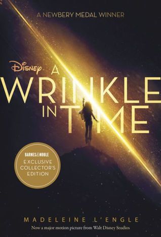
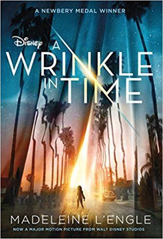
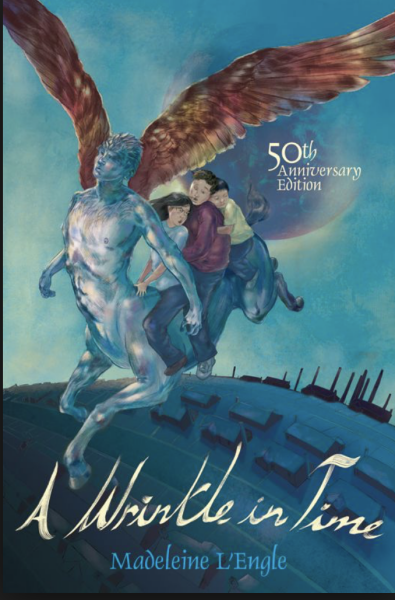
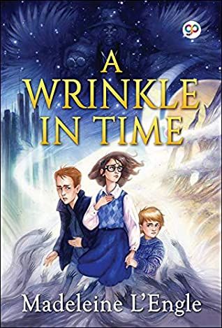
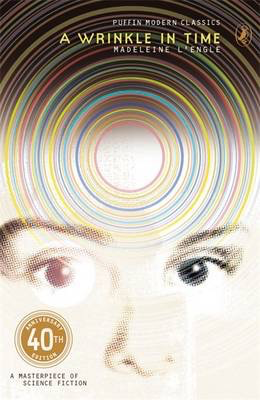
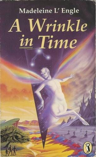
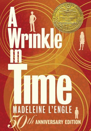
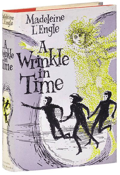
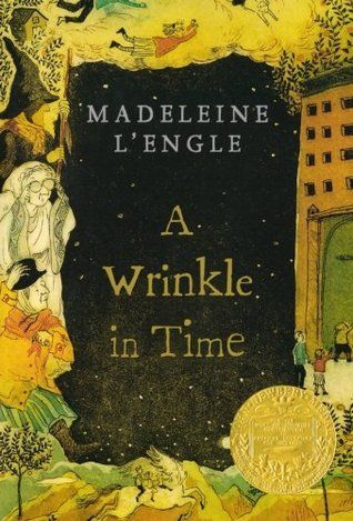
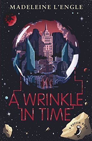
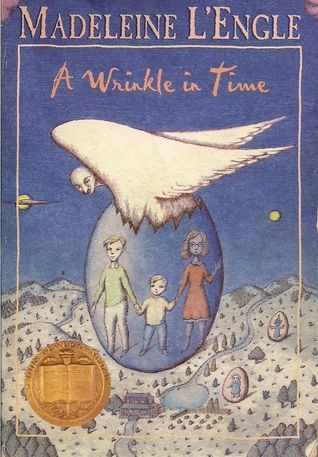
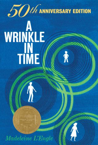
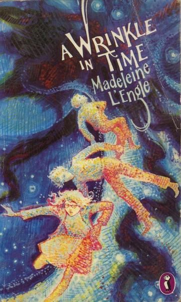
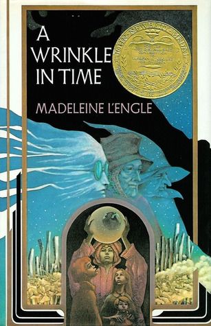
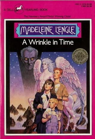
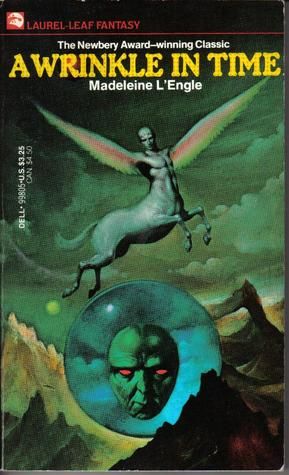
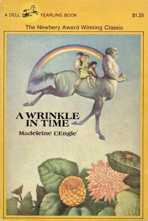
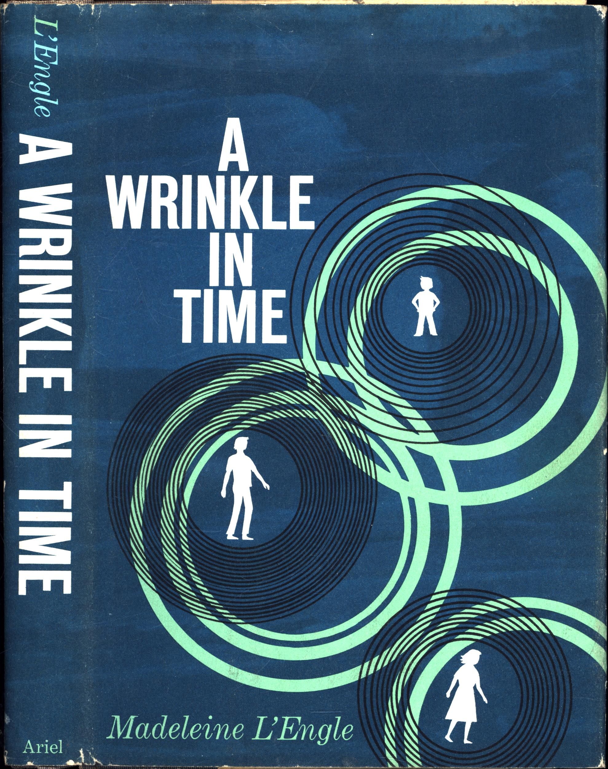
I reread the book as I was writing this piece, and I was struck by how abstract it is. It wasn’t always easy for me to picture the action or the environment, partially because there’s so much of both, and I think that’s reflected in the truly remarkable diversity of the book’s covers. It was also remarkable to notice what a textbook ADHD queen Meg is. That observation helped me understand why I, as a kid who overly regulated my emotions allllll the way down, did not relate to her outbursts the way other readers did. What did spark my imagination as a kid, however, was the concept of the tesseract and understanding how moving through different spatial dimensions works. What readers love about the book, like Meg’s character arc and the heady exploration of spacetime, are tricky to convey on a book cover. So let’s look at what these illustrators and designers attempted to show. I’ll rank all the English language covers I found, because I can’t resist a countdown. Do you want to read more about A Wrinkle in Time? We’ve got an essay about one reader’s experience with depression and this book, as well as a tale of revisiting it as an adult. And did I miss any covers? Do you agree with my rankings? If you don’t, I will give you the same advice Mrs. Whatsit gave little Meg: stay angry. Artist: Sure did. Absolute nightmare fuel, just like you asked. Publisher: What?
